


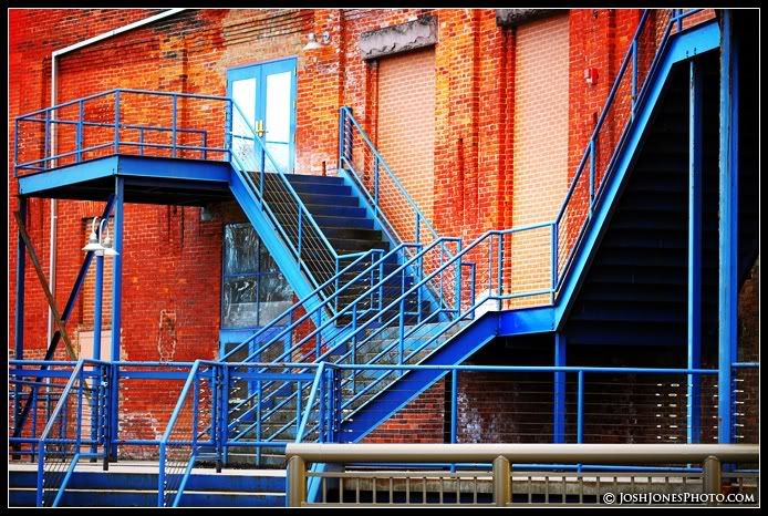
I took this picture downtown the other day. It's just a pretty ordinary scene but the strong blues and vivid reds really make the photo interesting. Here's a quick tip: Next time your out shooting look for scenes where there are two wildly different colors. It can turn a very ordinary scene into something beautiful.
These colors, angles and textures are amazing. Who knew you would get this from such an 'ordinary' location!
ReplyDeleteNice use of complementary colors! Of course, good comp helps too.
ReplyDelete